← Branding & visuals

Branding & visuals / Brand identity

DoorE

Remember it when you get there.

A reminder tied to a place.

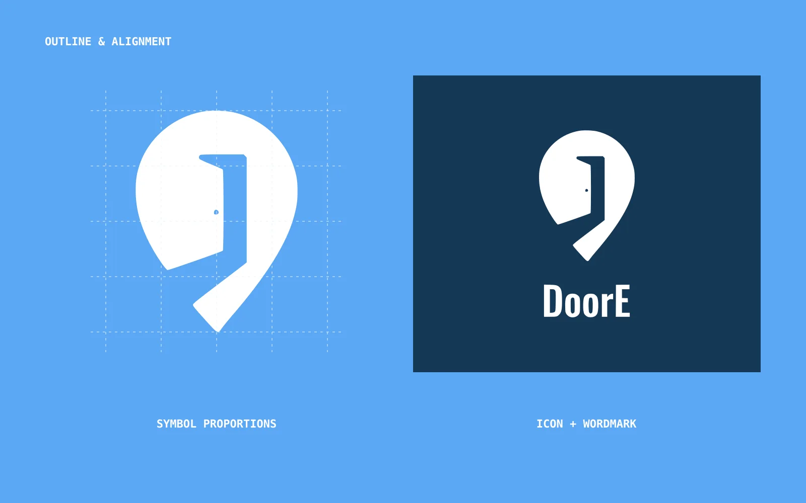
DoorE is a location-based reminder app. I designed the identity around a reminder arriving when you get to the right place.
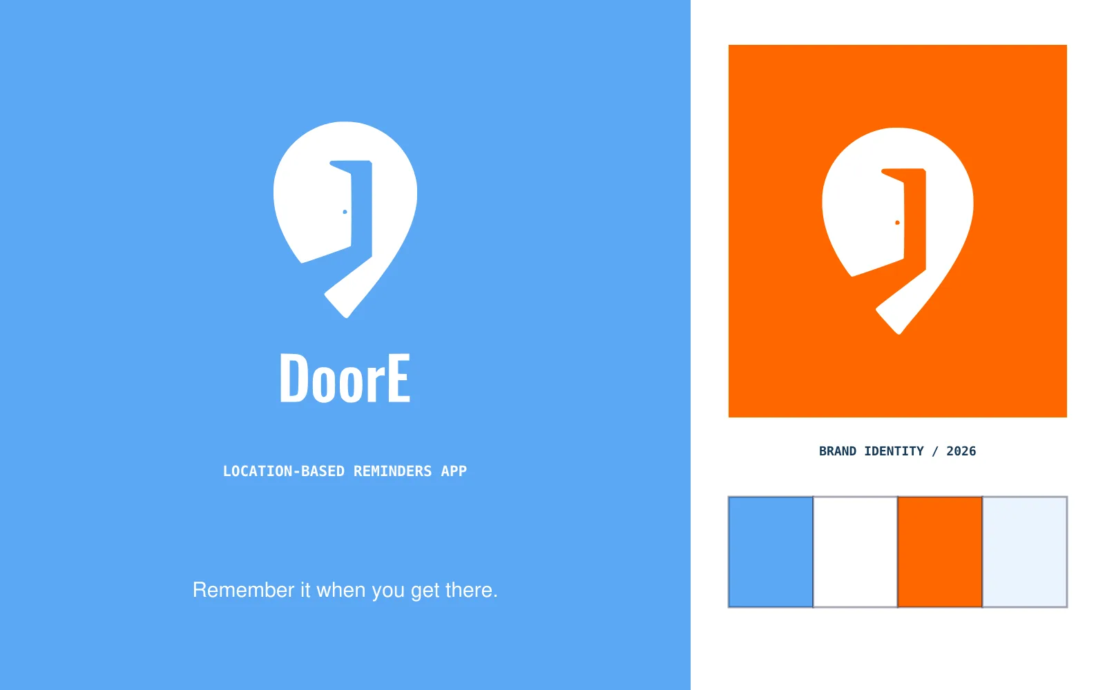
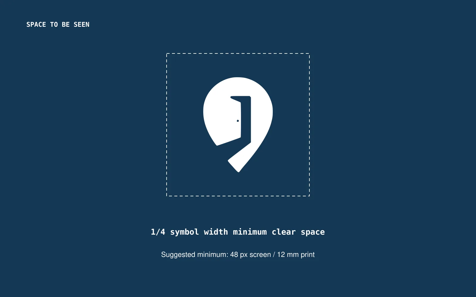
DoorE identity overview
DoorE identity overviewEnlarge ↗

My role · Logo / Colors and type / Mockups

Color and type.

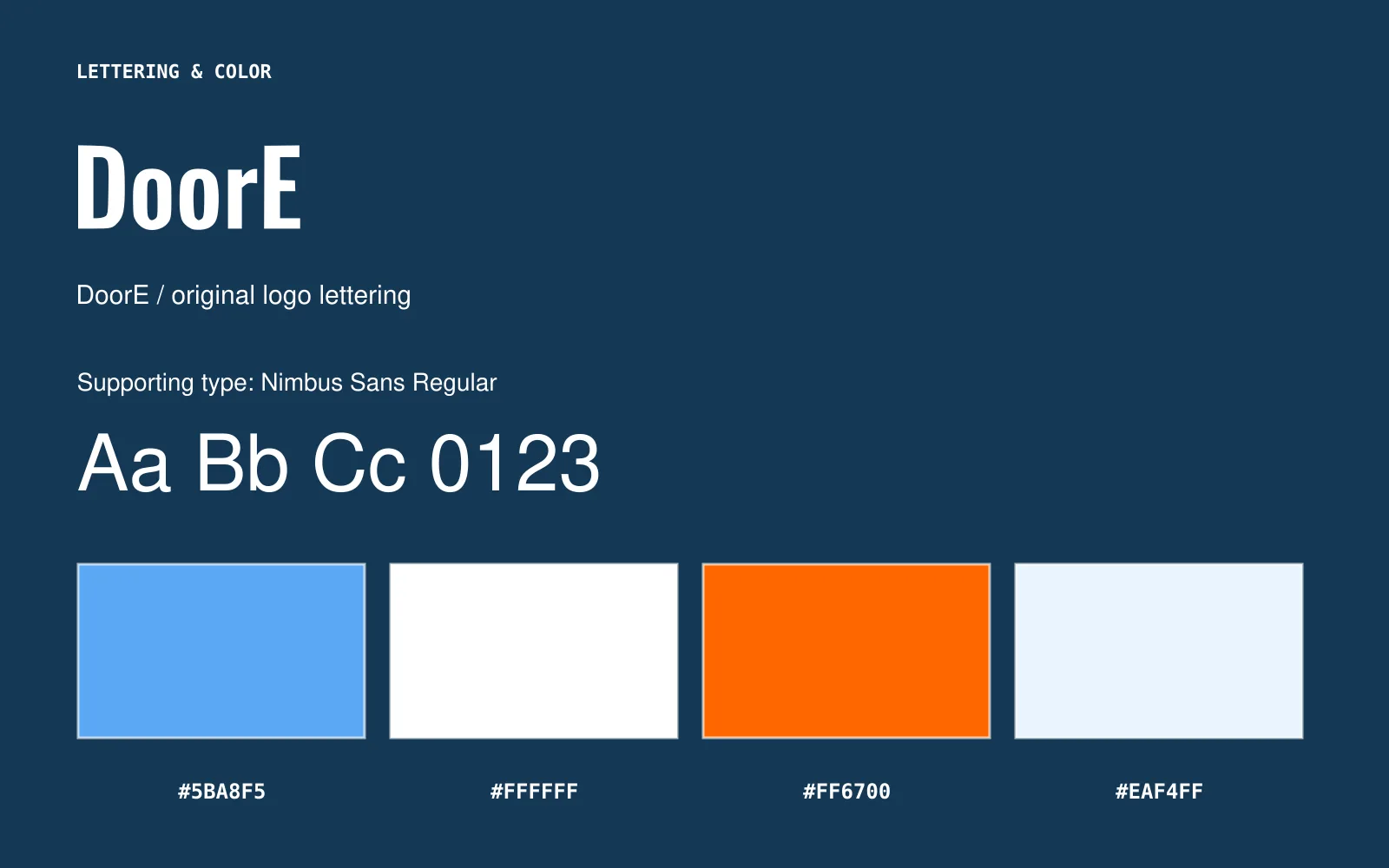
Blue and white are the main colors, with orange for emphasis. I kept the supporting text simple so short reminders stay easy to read.

Lettering, fonts, and colors
Lettering, fonts, and colorsEnlarge ↗
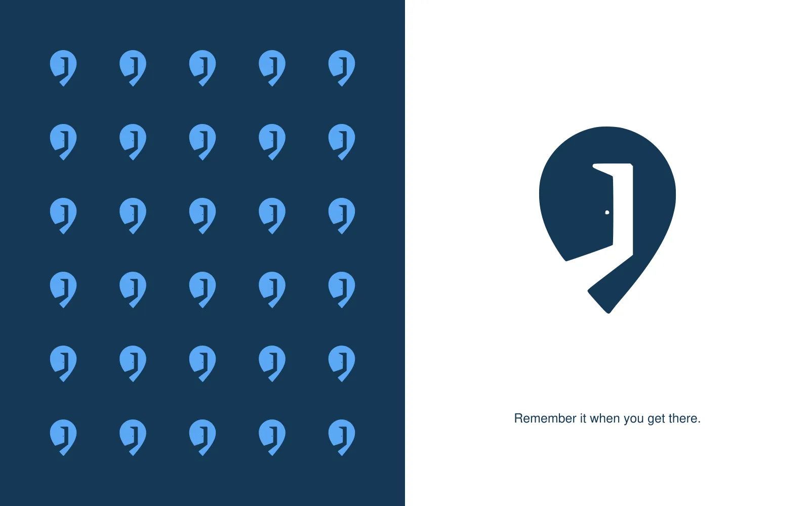
Pattern made from the symbol
Pattern made from the symbolEnlarge ↗

Putting it to use.

I used a phone logo screen, posters, cards, and stickers to introduce the app. The door and pin keep the connection to place clear.

Application mockups · Select an image to take a closer look.
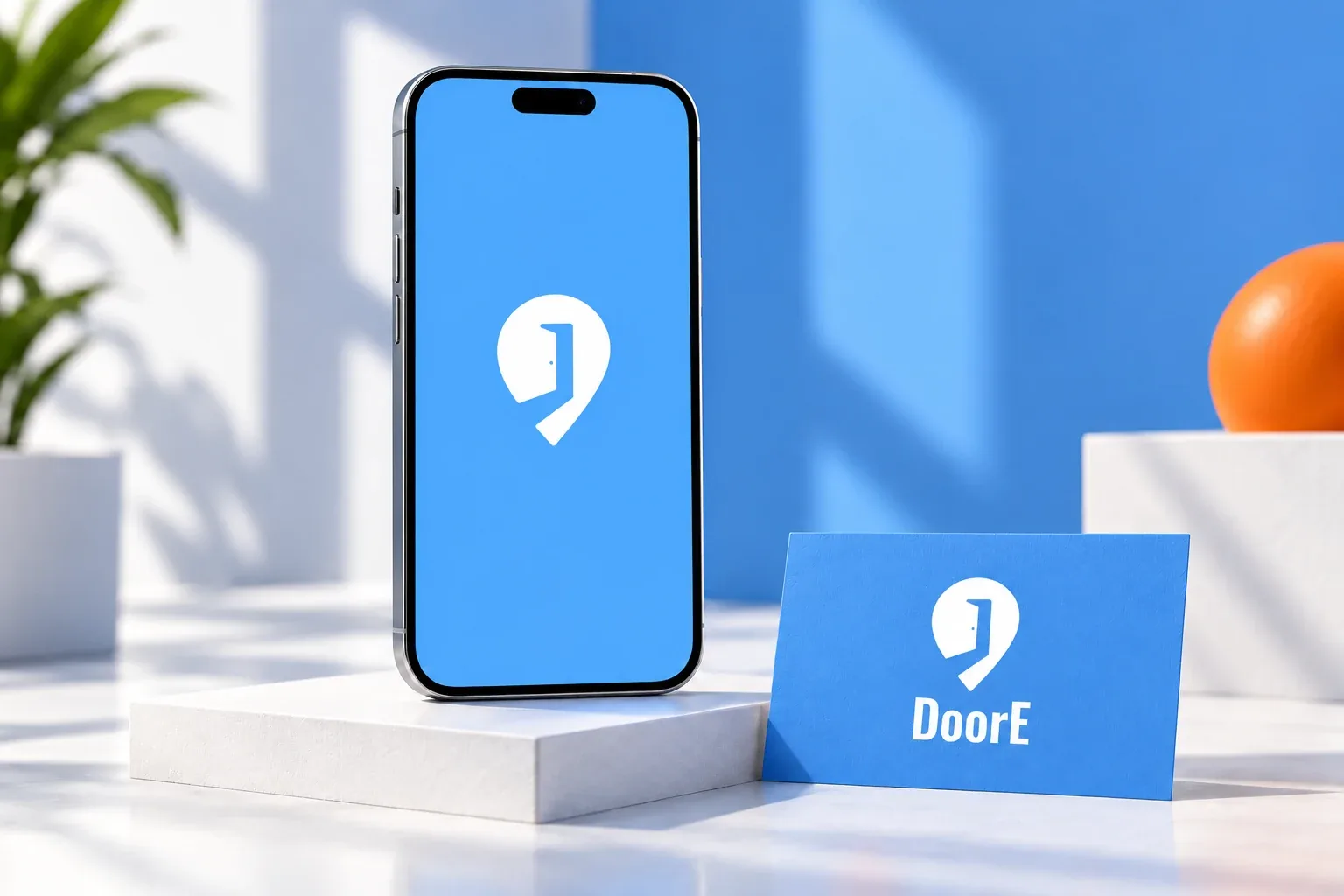
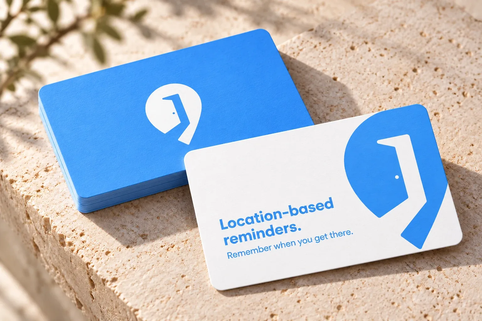
Blue logo splash and promotional card
Blue logo splash and promotional cardEnlarge ↗
Promotional cards for a location-based reminder app
Promotional cards for a location-based reminder appEnlarge ↗
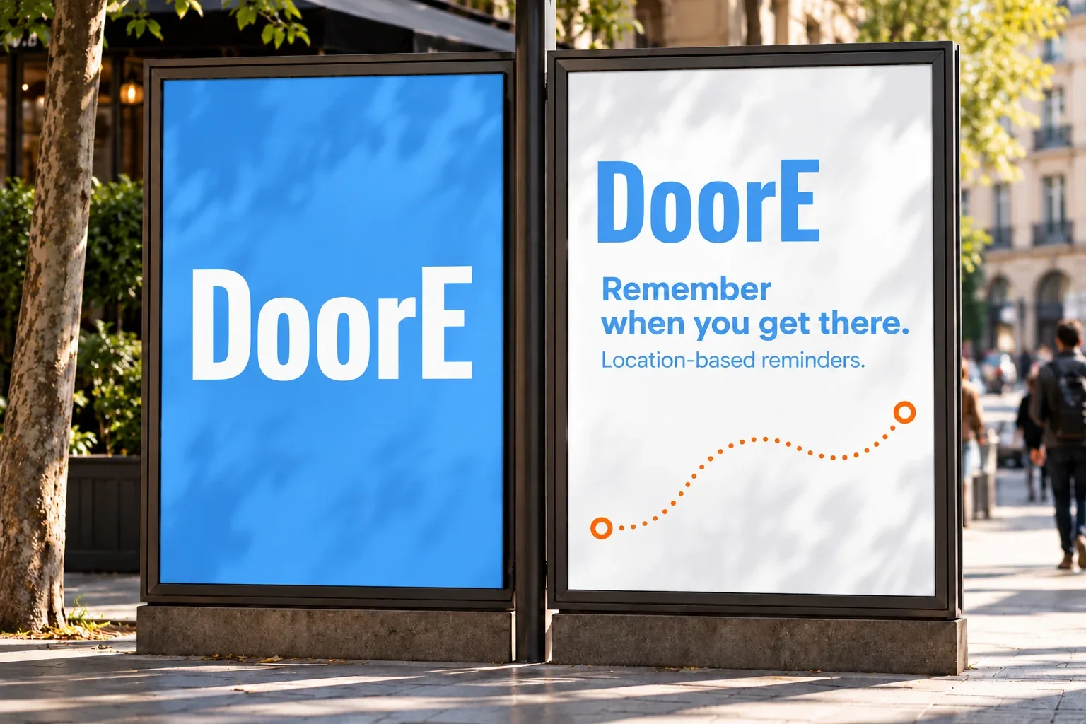
Location-based reminder campaign
Location-based reminder campaignEnlarge ↗
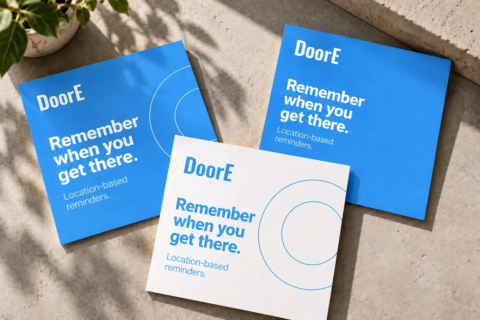
Social campaign artwork presented as printed design proofs
Social campaign artwork presented as printed design proofsEnlarge ↗
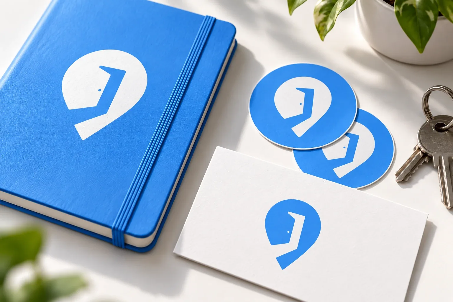
Die-cut logo stickers and a small brand stationery set
Die-cut logo stickers and a small brand stationery setEnlarge ↗
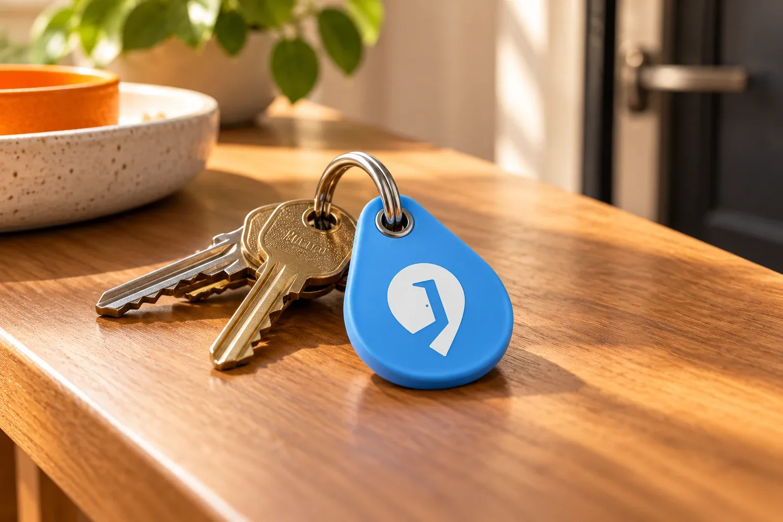
location-door symbol on a key organizer
location-door symbol on a key organizerEnlarge ↗
Branded magnetic errand board for an entryway
Branded magnetic errand board for an entrywayEnlarge ↗
View campaign artwork
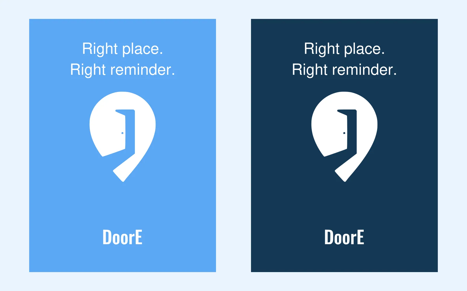
Poster compositions
Poster compositionsEnlarge ↗
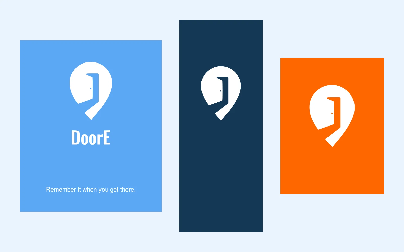
Digital campaign formats
Digital campaign formatsEnlarge ↗

Take a closer look.

The full set includes eight design boards, seven mockups, logo files, colors, and a short guide.

Logo files, brand guidelines, and application mockups.